Building Dynamicweb Module Admin Interfaces 1 - Introduction
NOTE: the concepts presented in this article are now considered obsolete possibly because better alternatives are available.
This is part one in a multi-part article series on building custom administrative user interfaces using the Dynamicweb UI controls such as the RibbonBar.
As you may have seen in the article series on building custom modules, pages you create to manage your custom modules in the administrative section of Dynamicweb are 100% ASP.NET. This means you can use whatever technique you prefer to create these pages. To build up the user interface you can use standard ASP.NET controls such as the Button, the GridView and the ListView. Alternatively, you can use third-party controls such as those from DevExpress or Telerik. However, to create modules that look and feel like Dynamicweb modules, you can also make use of the many built-in controls that ship with Dynamicweb. This helps your end-users familiarize themselves much quicker with your modules as they already know how to interact with many of the UI controls from working with the standard Dynamicweb modules.
Note: if you haven’t read the series on building custom modules, you’re encouraged to do that now. The sample application used in this new series builds on top of the sample application that I built and explained in detail in the previous series.
In this introductory article, I’ll give you a brief overview of many of the controls that you have at your disposal. In later parts in this series I’ll show you how to use these controls in your own code. You can find a complete list of the available controls and their API documentation on the Engage web site at http://engage.dynamicweb-cms.com/api/controls/.
The RibbonBar control
The RibbonBar is probably the most familiar control. It looks and behaves just as the Ribbon interface used in Microsoft Office 2007 and Office 2010 applications such as Word, Excel and Outlook. Figure 1 shows the RibbonBar in Dynamicweb when editing a page.
The control itself can contain a number of other controls, including:
- RibbonBarTab – Used to create different tabs, such as the Content and Tools tabs in Figure 1.
- RibbonBarGroup – Used to created different groups on a tab, such as the Insert and Content groups in Figure 1.
- Within the RibbonBarGroup you can use a number of other controls such as:
- RibbonBarButton
- RibbonBarCheckbox
- RibbonBarPanel
- RibbonBarRadioButton
- RibbonBarScrollable
Many of the controls within the RibbonBarGroup expose client and server side events that you can handle. Part 2 through 4 of this series will show you how to use the RibbonBar and other controls to create good-looking and intuitive user interfaces for your Dynamicweb custom modules.
The List control
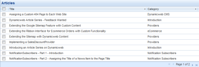
The List control enables you to present content in a list. Examples in the Dynamicweb UI include the list of paragraphs when editing a page, the products in the Product Catalog module and the list of orders. The control supports features such as sorting, paging, selection and filtering. Figure 2 shows an example of the List control displaying the articles in my custom DvkArticles module:
In part 5 of this series you see how to build this list to display the articles in the system.
The Dialog control
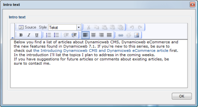
The Dialog control enables you to create a floating and draggable pop-up window. The control can contain other markup such as HTML and ASP.NET server controls, enabling you to completely customize its looks and content. The control has properties to change the appearance of various buttons (OK, Close, Cancel etc.) and their client side functions that get executed when you click them. In Figure 3 you see an example of a Dialog that in turn contains an Editor control.
In part 3 in this series you see how to use the Dialog control.
The InfoBar control
The InfoBar control is used to display short messages to the user. It typically appears at the top of the page so it draws the user’s attention. Out of the box it supports three types of messages (Error, Information and Warning), each represented by an icon. You can also assign a custom image. Figure 4 shows the InfoBar using the three default built-in message types and a custom one, featuring the logo of De Vier Koeden:
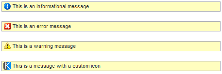 Figure 4
I’ll show you how to use the InfoBar control in a reusable way in part 5 of this series.
The GroupBox control
The GroupBox control renders as HTML <fieldset /> and <legend /> elements and enables you to logically group controls together. Figure 5 shows the control in action. The text IE 8 Compatibility is set using the control’s Title property. The control’s content can be a combination of regular HTML and ASP.NET server controls.

Figure 5
You can see this control at work in the Article module’s _Edit page and in the AddEditArticle.aspx page of the final sample application.
The TabHeader control
The TabHeader renders a series of tabs and is typically used to divide complex pages or forms in multiple areas, each accessible by its own tab. Figure 6 shows an example of the TabHeader control in action.

Figure 6
You can determine the selected tab programmatically in a few different ways, including sending its (one based) index through a Query String variable called Tab. Redirecting to SomePage.aspx?Tab=2 would make the Categories tab the selected item.
The Tree control
The Tree control (shown in Figure 7) enables you to render a tree-like structure. The Tree is pretty versatile and supports features such as drag and drop and AJAX-enabled load-on demand features.
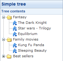
Figure 7
The Tree control is not used in the sample application, but you can find information on how to use it on the Engage web site.
The EditableGrid control
The EditableGrid is similar to a standard ASP.NET GridView, but enables you to edit multiple items at once. Figure 8 shows the EditableGrid as it’s used in the SDK documentation samples for the UI controls.
Just as the Tree control, the EditableGrid is not used in the sample application, but you can find information on how to use it on the Engage web site.
The Toolbar control
When a RibbonBar is overkill, but you still need to present a few logically grouped buttons, the Toolbar control is the one to use. It enables you to define buttons with standard or custom images. Additionally, you can create an expandable button which in turn can show a ContextMenu that contains more menu items. In Figure 9 you see the toolbar. The Settings button is expandable and shows the context menu that’s associated with it when you click the down arrow next to the button.
![]()
Figure 9
The Toolbar is not used in the sample application. However, it’s pretty easy to use so if you need it now, you’ll be able to figure out how to use it.
The ContextMenu control
The ContextMenu control can be used to display a context menu at various locations in your page. A common place for this menu is as a right-click menu for items in the List control. Additionally, it can be used for the expandable button on the Toolbar, as shown in Figure 10:

Figure 10
The ContextMenu is used and demonstrated in part 5 of this series to enable a context menu in the list of articles.
The RichSelect and RichSelectItem controls
The RichSelect control can be used to create drop-down lists with rich content. Examples of the control in Dynamicweb can be found in the Paragraph Template and Layout selection controls. Items can be added programmatically only, using the RichSelectItem class. Figure 11 shows an example of a control with three items, two of which contain a combination of an HTML table, an image and some formatted text.
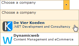
Figure 11
You can find out more about the RichSelect control on the Engage web site.
The Editor, FileArchive, FileManager and LinkManager controls
You’ve seen these controls used in the article series on building custom modules. Their usage is pretty straight-forward as they don’t require you to set a lot of properties or handle events. I won’t dig any deeper into these controls in this series, but use them where they make sense. Check out the API documentation on the Engage website for an overview of their members and usage:
The ControlResources control
This control is not visible in your pages, but plays a very important role in most of your administrative pages. You need to include this control in most of your pages (or in a Master Page) in order for the other controls to work. The ControlResources control adds references to the many JavaScript and CSS files that many of the controls rely on to the head section of your page. If you find that the controls look or behave funky, chances are you forgot to include this control in your Admin pages. To use the control, add it to the <head /> section of an ASPX Page or Master Page like this:
<head runat="server">
  …
  <dw:ControlResources ID="cr1" runat="server" />
  …
</head>
The ControlResources control has the following properties that influence its behavior:
Name |
Description |
IncludePrototype |
Determines whether or not to include a link to the Prototype library. False by default. Even with this setting turned off, you may get a reference to the Prototype library, as Dynamicweb controls that require this library add a reference to it automatically. Note: some controls (such as the RibbonBar) require Prototype, but don’t register it themselves. If you’re just using a RibbonBar, be sure to set this property to True. |
IncludeScriptaculous |
Determines whether or not to include a reference to the Scriptaculous library. False by default. Even with this setting turned off, you may get a reference to the Scriptaculous library, as Dynamicweb controls that require this library add a link to it automatically. |
IncludeUIStylesheet |
Determines whether or not to include a link to the StyleSheetNewUI.css file. True by default. |
Depending on the controls you have in your page, and the properties you set on the ControlResources control, you end up with references in the <head /> of your page similar to the following:
<head>
  <!-- Controls resources start -->
  <link rel="stylesheet" type="text/css"
      href="/Admin/Images/Ribbon/UI/Tree/Tree.css" />
  <link rel="stylesheet" type="text/css"
      href="/Admin/Images/Ribbon/UI/Richselect/Richselect.css" />
  <link rel="stylesheet" type="text/css"
      href="/Admin/Images/Ribbon/Ribbon.css" />
  <script type="text/javascript"
      src="/Admin/Content/JsLib/dw/Ajax.js"></script>
  <script type="text/javascript"
      src="/Admin/Images/Ribbon/UI/Tree/Tree.js"></script>
  <script type="text/javascript"
      src="/Admin/Filemanager/Upload/js/EventsManager.js"></script>
  <script type="text/javascript"
      src="/Admin/Content/JsLib/prototype-1.6.1.js"></script>
  <script type="text/javascript"
      src="/Admin/Images/Ribbon/Ribbon.js"></script>
  <script type="text/javascript"
      src="/Admin/Images/Ribbon/UI/Tree/TreeDragDrop.js"></script>
  <script type="text/javascript"
      src="/Admin/Images/Ribbon/UI/Richselect/Richselect.js"></script>
  <script type="text/javascript"
      src="/Admin/Content/JsLib/scriptaculous-js-1.8.2/src/
           scriptaculous.js?load=effects,dragdrop,slider"></script>
  <!-- Controls resources end -->
</head>
If you check out the API documentation for the Dynamicweb.Controls namespace, you’ll see that the namespace includes more controls than I have listed here. Some of those are used within the context of others, and thus aren’t discussed separately. Others aren’t used very often (anymore) and are thus not very relevant to this article series. Yet others may be relevant to your custom modules, but I simply haven't discussed them yet. If you want me to dig deeper into some of those controls, let me know through my Contact page.
In the next three parts of this article series, I’ll show you how to use the RibbonBar and many of its child controls. The fifth part of this series will dig deeper in a number of the other controls I introduced in this article such as the List and the ContextMenu.
Downloads
Since this is just a general overview, there's no download for this article. Starting with the next article in the series, you can download the full source for the sample application (which is in C#) that I started in the article about custom modules.
