Building Dynamicweb Module Admin Interfaces 2 - Using the Ribbon UI – Introduction
NOTE: the concepts presented in this article are now considered obsolete possibly because better alternatives are available.
This is part two in a multi-part article series on building custom administrative user interfaces using the Dynamicweb UI controls such as the RibbonBar. If you haven’t read the first part, you should check it out first as it contains information that’s used again in this article. You can find the article here:
In the previous article in this series I briefly introduced a number of important controls that you can use in the administrative sections of your custom Dynamicweb modules. In this and the next few articles, I dig deeper into a specific set of them: the RibbonBar control and many of its related child controls.
Introducing the RibbonBar
The RibbonBar I’ll build over the next few articles will be used to let you manage the articles in the database. This builds on top of the sample application I built in the series about custom modules. The user interface to manage articles look like this:
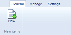
Figure 1
The General tab has a single button that enables you to create a new item (on the AddEditArticle.aspx page). The Manage tab is used to manage articles and contains two buttons: Copy and Delete:
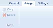
Figure 2
These buttons become available (and the Manage tab becomes the active one) as soon as one or more articles are selected in the articles list. Using the Copy or Delete buttons you’ll then be able to create a copy of the selected articles, or mark them as deleted in the database.
On the Settings tab you find a button that triggers a Dialog control with an Editor that enables you to define an introductory text for the module’s main page. Additionally, it has a Save button to save the changes to the database. You see the Settings tab in Figure 3:
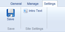
Figure 3
I’ll create another RibbonBar control for the article’s Add/Edit page that enables you to create new and edit existing articles. This RibbonBar will contain two tabs: one with some general controls to save the article, assign it to a category and choose a CSS style which can be used later when presenting the article. Figure 4 shows that RibbonBarTab in action:
If you switch to the Tools tab you see controls that enable you to determine the article’s publication period, whether it’s current visible on the site and whether or not the Last Modified Date should be updated when the article is saved (this is off by default, and needs to be turned on every time you want to update this field in the database when you save the article). Figure 5 shows the Tools RibbonBarTab:
Note that the RibbonBar control in Default.aspx is possibly more complex than it needs to be. In a real world application like this, where you only have a limited amount of functionality, you’re probably better off creating a single RibbonBarTab with all controls on one location or even with a single Toolbar control. However, in order to show you how to build more complex Ribbons, I decided to spread out the functionality over multiple tabs.
As I hinted in my previous article, the RibbonBar itself can contain a number of other controls. The documentation for the RibbonBar shows the relationship between the controls in Figure 6:
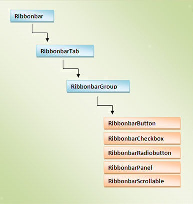
Figure 6
A page in your administrative section contains a single RibbonBar control, which in turn contains one or more RibbonBarTab controls (the General and Tools tabs in Figure 4). Each tab is then split up in one or more RibbonBarGroup controls (such as Tools and Category in Figure 4) which eventually contain controls such as the RibbonBarButton. In the next few sections I’ll introduce you to each of these controls and show you how to build up the UI shown in Figures 1 through 5.
Shared Properties
A number of the controls you can use on the RibbonBar feature two handy properties: ModuleSystemName and Version. Using ModuleSystemName, you can have the control show up only when the user has access to a given module. So, if for example you want to show a RibbonBarGroup only when the eCommerce Payment Gateway module is available (for example, when your custom module exports paid orders to a backend system), you use the module’s system name (which you can find in the Modules table in the database) like this:
<dw:RibbonBarGroup ID="exportGroup" Name="Export" runat="server"
           ModuleSystemName="eCom_Payment">
  <dw:RibbonBarButton runat="server" Text="Export" Size="Large"
       ImagePath="/Images/Export.gif" ID="exportButton" />
</dw:RibbonBarGroup>
Likewise, if your controls require a specific minimum version of Dynamicweb to function you can specify the version number in the Version property:
<dw:RibbonBarGroup ID="exportGroup" Name="Export" runat="server"
                Version="19.1.1.0">
  <dw:RibbonBarButton runat="server" Text="Export" Size="Large"
     ImagePath="/Images/Export.gif" ID="exportButton" />
</dw:RibbonBarGroup>
With this code, the entire RibbonBarGroup will be hidden when run on solutions earlier than 19.1.1.0.
You can combine the two properties to have controls appear only for specific modules running on specific (minimum) versions of Dynamicweb.
The RibbonBar
The RibbonBar control serves as the main container for all the other Ribbon controls. It’s quite simple and has only a few relevant properties. To define one in your page, add the following code to the main body:
<dw:RibbonBar ID="myRibbon" runat="server">
</dw:RibbonBar>
Note: Don’t forget to include a reference to the ControlResources control in your page (in the <head /> section for example), like this:
<dw:ControlResources ID="ctrlResources" runat="server" />
The RibbonBar control has a few properties that you can set declaratively or programmatically:
| Name | Description |
ActiveTab |
The one-based index of the active tab. To make the Manage tab in Figure 1 the active tab, you would set ActiveTab like this: |
DisableAddIns |
Enables you to block AddIns for this RibbonBar. For more information about AddIns, see the article Extending the Ribbon Interface for Ecommerce Orders with Custom Functionality. |
ShowTrace |
This property is used to embed Trace information from custom AddIns. For more information, see section 5.2 of the "Dynamicweb Ribbon Extensibility" documentation at http://engage.dynamicweb-cms.com/Development-200.aspx |
Since the RibbonBar is just a container, you need to add child controls to it to make it do something. The only directly allowed control is the RibbonBarTab control.
The RibbonBarTab
The RibbonBarTab control is used to define the tabs that appear on the ribbon. You typically have two or more tabs on a RibbonBar. If you only have the need for a single tab and just a few controls, the Toolbar control may be a better fit.
You define a RibbonBarTab control like this:
<dw:RibbonBar ID="myRibbon" runat="server">
  <dw:RibbonBarTab ID="tabGeneral" Name="General" runat="server">
  </dw:RibbonBarTab>
  <dw:RibbonBarTab ID="tabManage" Name="Manage" runat="server">
  </dw:RibbonBarTab>
  <dw:RibbonBarTab ID="tabSettings" Name="Settings" runat="server">
  </dw:RibbonBarTab>
</dw:RibbonBar>
The only two relevant properties this control has are Name and OnClientClick. Name defines the text you see on the tab, while OnClientClick enables you to define a JavaScript function that is triggered when you click the tab. This can be useful if you want to lazy-load some data on a tab, or have other initialization tasks that need to be carried out when a tab gets clicked.
Within each tab, you can group controls using the RibbonBarGroup control.
The RibbonBarGroup
As you can see in Figure 1, the General tab contains a single group, labeled New items. In most cases, a RibbonBarTab contains more than one group, but this is not required. You define groups using a RibbonBarGroup element, and set its Name property to define the text for the group, like this:
<dw:RibbonBar ID="myRibbon" runat="server">
  <dw:RibbonBarTab ID="tabGeneral" Name="General" runat="server">
    <dw:RibbonBarGroup ID="newItemsGroup" Name="New items" runat="server">
    </dw:RibbonBarGroup>
  </dw:RibbonBarTab>
  …
</dw:RibbonBar>
If you’d combine and paste the previous code snippets in an Admin page of your custom module and viewed the page in your browser, you’d see the following:
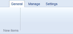
Figure 7
To add functionality to the RibbonBarGroup, you can use one of five RibbonBar controls discussed next.
RibbonBar Controls
The Dynamicweb RibbonBar control supports five different child controls that are displayed on the ribbon. While it may seem that five controls is not a whole lot, you can actually embed pretty much any other control in the RibbonBar using a RibbonBarPanel which serves as a wrapper around other controls. In the following sections, I’ll discuss the five RibbonBar controls, show you their most common properties and give you a few examples on how to use them.
RibbonBarButton
The RibbonBarButton has a few different ways to present itself. By default, a button is drawn with a large image, like this:

Figure 8
You define the icon and text by setting the Image and Text properties, like this:
<dw:RibbonbarButton runat="server" Text="Gem" Image="Save" ID="RibbonbarButton3" />
Here, the Danish Gem has been translated to Save automatically. The Image property refers to one of the many predefined images. IntelliSense will help you pick an appropriate image. If you want to see all available images without trying them out one by one, take a look at the folder Admin\Images\Ribbon\Icons located under your default Dynamicweb installation folder on disk.
By assigning a value to the ImagePath property instead, you can override the built-in image and supply your own.
Instead of a large button, you can also draw a small version of the button by setting the Size property to Small:
<dw:RibbonbarButton runat="server" Text="Gem" Image="Save" Size="Small"
      ID="RibbonbarButton3" />
This renders the button as follows:
![]()
Figure 9
With both buttons, you can also specify a ContextMenuId which points to a ContextMenu defined elsewhere in the page. When you specify a context menu, the buttons change appearance and display the context menu when clicked. You see an example of the large and small button with a context menu in Figure 10:
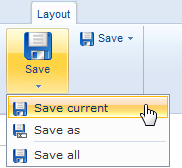
Figure 10
The ContextMenu control is discussed later in this series (in part 5 to be exact), but in case you want to know how it looks here’s the code snippet used for the menu from Figure 10:
<dw:ContextMenu ID="settingsMenu" runat="server">
  <dw:ContextMenuButton ID="ContextMenuButton1" Text="Save current" Image="Save"
        runat="server" />
  <dw:ContextMenuButton ID="ContextMenuButton2" Text="Save as" Image="SaveAs"
        runat="server" Divide="After" />
  <dw:ContextMenuButton ID="ContextMenuButton3" Text="Save all" Image="Save"
        runat="server" />
</dw:ContextMenu>
Besides the Text, Size, Image and ImagePath properties, the RibbonBarButton control has the following properties:
| Name | Description |
Disabled |
When set to True, renders the button in a disabled state. |
EnableServerClick |
Determines whether the control can cause a postback. Used together with the server-side Click event. |
Hide |
Enables you to hide the button at the client using display: none. Different from the Visible property that hides the button server side. |
OnClientClick |
Enables you to define the JavaScript that is executed when the button is clicked. This is discussed in more detail in part three of this series. |
Title |
Defines the tooltip for the control which is shown when you hover over it. |
ContextMenuId |
Enables you to point to an existing ContextMenu control in the page which is shown when the button is expanded. |
PerformValidation |
This property determines whether or not client side ASP.NET validation is triggered. Similar to what CausesValidation does in standard ASP.NET controls, but just with a different name. |
SplitButton |
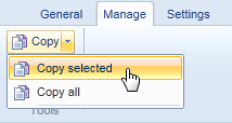
This property enables a nice feature. When set to True, and when the control has a ContextMenu attached to it, the button is split in two. When you click the main button, its client or server click is executed. But if you click the tiny down arrow, the context menu appears, as shown in Figure 11
|
Not all of the properties of the RibonBarButton are used in the sample application, but those that are used are discussed in the next section.
The RibbonBar, RibbonBarTab, RibbonBarGroup and RibonBarButton controls in the sample application
To build the RibbonBar as shown earlier in this article, I am using the following code:
<dw:RibbonBar ID="myRibbon" runat="server">
  <dw:RibbonBarTab ID="generalTab" Name="General" runat="server">
    <dw:RibbonBarGroup ID="newItemsGroup" Name="New items" runat="server">
      <dw:RibbonBarButton runat="server" Text="New" Size="Large"
           Image="AddDocument" ID="newButton" Title="Create new article" />
    </dw:RibbonBarGroup>
  </dw:RibbonBarTab>
  <dw:RibbonBarTab ID="manageTab" Name="Manage" runat="server">
    <dw:RibbonBarGroup ID="toolsGroup" Name="Tools" runat="server">
      <dw:RibbonBarButton Disabled="true" ID="copyButton" Size="Small" Text="Copy"
            Image="Copy" runat="server" Title="Copy selected articles" />
      <dw:RibbonBarButton Disabled="true" ID="deleteButton" Size="Small"
         Text="Delete" Image="Delete"
         runat="server" Title="Delete selected articles" />
    </dw:RibbonBarGroup>
  </dw:RibbonBarTab>
  <dw:RibbonBarTab ID="settingsTab" Name="Settings" runat="server">
    <dw:RibbonBarGroup ID="saveGroup" Name="Save" runat="server">
      <dw:RibbonBarButton ID="saveButton" Text="Save"
             Image="Save" runat="server" />
    </dw:RibbonBarGroup>
    <dw:RibbonBarGroup ID="siteSettingsGroup" Name="Site Settings" runat="server">
      <dw:RibbonBarButton ID="introTextButton" runat="server" Text="Intro Text"
             Size="Small" Image="Tree" />
    </dw:RibbonBarGroup>
  </dw:RibbonBarTab>
</dw:RibbonBar>
Note that this code only defines the looks of the controls; I haven’t yet defined any behavior for their client and server side click events, but I’ll show you how to do that in later parts in this series. You can find the full source for this RibbonBar and the one for the Add/Edit page in the downloadable source that you find at the end of this article.
RibbonBarCheckbox
The RibbonBarCheckbox can present itself as an image, but behave as a checkbox. When the checkbox isn’t checked, an image in a normal state is displayed. When the checkbox is checked (either manually by clicking it, or programmatically), the image is displayed in a pressed state. For cases where you don’t want an image, but a standard checkbox instead, you can set the control’s RenderAs property to FormControl.
Figure 12 shows six RibbonBarCheckbox controls: four using large and small images, each in an unchecked and checked state, and two which render as a standard checkbox.

Figure 12
The code for these six controls looks like this:
<dw:RibbonBarTab ID="CheckBoxTab" Name="RibbonBarCheckbox" runat="server">
  <dw:RibbonBarGroup ID="AsLargeImageGroup" Name="As Large Image" runat="server">
    <dw:RibbonBarCheckbox Size="Large" Checked="false" runat="server"
          Image="Check" ID="Publish1" Text="Publish" />
    <dw:RibbonBarCheckbox Size="Large" Checked="true" runat="server"
          Image="Check" ID="Publish2" Text="Publish" />
  </dw:RibbonBarGroup>
  <dw:RibbonBarGroup ID="AsSmallImageGroup" Name="As Small Image" runat="server">
    <dw:RibbonBarCheckbox Size="Small" Checked="false" runat="server"
          Image="Check" ID="Publish3" Text="Publish" />
    <dw:RibbonBarCheckbox Size="Small" Checked="true" runat="server"
          Image="Check" ID="Publish4" Text="Publish" />
  </dw:RibbonBarGroup>
  <dw:RibbonBarGroup ID="AsFormControlGroup" Name="As Form Control" runat="server">
    <dw:RibbonBarCheckbox Checked="false" RenderAs="FormControl" runat="server"
            ID="Publish5" Text="Publish" />
    <dw:RibbonBarCheckbox Checked="true" RenderAs="FormControl" runat="server"
            ID="Publish6" Text="Publish" />
  </dw:RibbonBarGroup>
</dw:RibbonBarTab>
The RibbonBarCheckbox control exposes the following properties:
| Name | Description |
Checked |
Gets or sets a value that determines whether the control is checked or not. |
Disabled |
When set to True, renders the button in a disabled state. It’s still rendered, so you can enable it again at the client. |
Hide |
Enables you to hide the button at the client using display: none. Different from the Visible property that hides the button server side. |
OnClientClick |
Enables you to define the JavaScript that is executed when the checkbox is clicked. |
Image |
One of the predefined Icon type enumeration members. You can find the complete list in IntelliSense or on the Engage web site. |
ImagePath |
A path to a custom image. When set, this property overrides the Image property. |
RenderAs |
Determines whether the control renders as an image (Default) or as a form control (FormControl). |
Size |
Determines the size of the image. Can be Large or Small. This setting does not take effect when the control renders as a standard form control. |
Text |
The text that appears next to or below the control. |
The RibbonBarCheckbox control in the sample application.
One of the places where the RibbonBarCheckbox control is used is in the AddEditArticle.aspx page to enable you to set the Published property of the article. The definition for the control looks like this:
<dw:RibbonBarGroup ID="RG1" Name="Category" runat="server">
  <dw:RibbonBarCheckbox ID="published" Text="Show On-line?" Image="Apply"
              runat="server" />
</dw:RibbonBarGroup>
In the code behind, the selected value is used like this:
article.Published = published.Checked;
You’ll see more of this in the next part in this article series.
If you don’t want check box behavior, but radio button behavior instead (where out of a group of controls only one can be selected at a time), you use the RibbonBarRadioButton.
RibbonBarRadioButton
In many ways, the RibbonBarRadioButton behaves exactly the same as the RibbonBarCheckbox. It also shares many of its properties with that control. The big difference between the two is that in a group of only RibbonBarRadioButton controls, exactly one is selected. You group multiple RibbonBarRadioButton controls together by setting the Group property like this:
<dw:RibbonBarRadioButton Size="Large" Checked="true" runat="server"
        Image="Delete" ID="Publish7" Text="Don't publish" Group="Group1" />
<dw:RibbonBarRadioButton Size="Large" Checked="false" runat="server"
        Image="Check" ID="Publish8" Text="Publish" Group="Group1" />
Figure 13 shows a screen shot similar to Figure 12 but uses RibbonBarRadioButton controls instead. Within each RibbonBarGroup, only one radio button can be checked as they share the same Group property. Note that the RibbonBarGroup has nothing to do with this; I just happened to assign unique Group values to each RibbonBarRadioButton within each RibbonBarGroup. If you want, you can group the radio buttons over multiple ribbon groups. However, from a usability perspective, it probably makes more sense to group mutually exclusive controls in the same RibbonBarGroup.

Figure 13
In addition to the properties shared with the RibbonBarCheckbox, the RibbonBarRadioButton has three additional properties: ContextMenuId, SplitButton and Value. The first two are used in the same way as with the RibbonBarButton; they enable you to create a drop-down menu that appears when you click the down arrow of the RibbonBarCheckbox. The Value property can be used to determine the value associated with the selected radio button in the group at the server.
The RibbonBarRadioButton control is not used in the sample application that comes with this article series.
If none of these controls satisfy your needs, you can use the RibbonBarPanel which enables you to freely define content for a panel on a RibbonBar.
RibbonBarPanel
In the Dynamicweb User Interface, the RibbonBarPanel is used in many locations to wrap controls that are not valid as direct child controls of the RibbonBarGroup. For instance, when editing a page, the date selectors for the start and end date of the page (shown in Figure 14) are wrapped in a RibbonBarPanel.
The RibbonBarPanel doesn’t have a whole lot of exciting properties. The most important ones are Hide (which renders the control to the browser but hides it using display: none) and ExcludeMarginImage which – when set to true – removes a few pixels of left margin to the left of it.
Using the control is pretty simple: just define it, and put whatever you see fit between its opening and closing tags. The following code snippet shows the code for a panel that in turn contains a drop down list and a simple HTML table:
<dw:RibbonBarPanel ID="Panel1" runat="server" ExcludeMarginImage="false">
  <div>
    <asp:DropDownList ID="DropDownList1" runat="server">
      <asp:ListItem>Choose something</asp:ListItem>
      <asp:ListItem>Choose something else</asp:ListItem>
    </asp:DropDownList>
  </div>
  <table style="height: 45px; margin: 0;">
    <tr><td><input id="Checkbox1" type="checkbox" />Some checkbox</td></tr>
    <tr><td><input id="Checkbox2" type="checkbox" />Another checkbox</td></tr>
  </table>
</dw:RibbonBarPanel>
When placed in a RibbonBarGroup and a RibbonBarTab, this code results in the following UI:

Figure 15
In the sample application, the RibbonBarPanel is used in AddEditArticle.aspx where it wraps the category selector, and the date pickers.
RibbonBarScrollable
The RibbonBarScrollable is an interesting control that enables you to create a very user-friendly interface to select a styled item from a (potentially) large list. It behaves similar to the Styles chooser in Microsoft Word 2010 that lets you choose a style to apply to a text. I didn’t have a strong use case for this control in my sample application, but to show you how to use it, I added one nonetheless. In the sample application the RibbonBarScrollable is used to choose a CSS class from a list. The CSS class is stored together with the article in the database and can be used to style, say, the title or first paragraph of an article. Again, not a strong use case, but it’ll suffice for this article.

Figure 16
When you click one of the selected styles, the value of the clicked item is stored in a hidden field (more on that in the next part in this article series). You can click the small up and down arrows at the right of the control to browse through the rows of items. If you want to see all styles at once, you can click the Expand icon at the bottom right. The full list of available styles then appears, as shown in Figure 17:
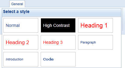
Figure 17
Once you click an item while the control is expanded, the value is stored and the control is collapsed again, scrolling the row with the selected item into view.
The control itself has only a few interesting properties that you can set, listed below:
| Name | Description |
Name |
The header that appears at the top of the list when the control is expanded (the Select a style heading in Figure 17) |
OnlyScroll |
Determines whether the control can be expanded. When set to true, you can’t click the Expand icon to bring up the view shown in Figure 17. |
RowsExpression |
This is a Prototype XPath selection rule that determines which elements to select and scroll into view when you click the Up and Down icons. If your scrollable items are made of table rows with a class like MyRow applied, the expression would be tr[class='MyRow']. |
Width |
Determines the width of the control. You normally don’t have to set the width as the control adjusts its width based on the items it contains. |
As its child content, the control expects some data that it can scroll. The following table meets the requirements, as it exposes three table rows which can be scrolled into view one by one, showing their child td elements.
<table class="stylesTable" cellpadding="0" cellspacing="0">
<tr class="stylesRow">
  <td><div class="styleItem">Normal</div></td>
  <td><div class="styleItem">High Contrast</div></td>
  <td><div class="styleItem">Heading 1</div></td>
</tr>
<tr class="stylesRow">
  <td><div class="styleItem">Heading 2</div></td>
  <td><div class="styleItem">Heading 3</div></td>
  <td><div class="styleItem">Paragraph</div></td>
</tr>
<tr class="stylesRow">
  <td><div class="styleItem">Introduction</div></td>
  <td><div class="styleItem">Code</div></td>
</tr>
</table>
Since each scrollable row has the CSS class “stylesRow”, the RowsExpression for the control would be tr[class='stylesRow']. You can use CSS to change the looks of the table, and each individual item. The following CSS gives the style items the appearance you see in Figures 16 and 17. Note: the individual text characteristics, such as the red and large font for the headings is applied with a separate class. You see how this works later.
.stylesTable
{
  background-color: #ffffff;
}
.stylesTable .styleItem
{
  line-height: 46px;
  width: 100px;
  height: 46px;
  cursor: pointer;
  margin: 4px;
  padding: 0 7px;
  border: 1px solid #c3c3c3;
}
Instead of a table you can also use div elements that in turn contain a number of other divs or other content. Here’s a quick example:
<div class="scrollDiv">
  <div class="scrollItem">Item 1</div>
  <div class="scrollItem">Item 2</div>
  <div class="scrollItem">Item 3</div>
</div>
<div class="scrollDiv">
  <div class="scrollItem">Item 4</div>
  <div class="scrollItem">Item 5</div>
  <div class="scrollItem">Item 6</div>
</div>
<div class="scrollDiv">
  <div class="scrollItem">Item 7</div>
  <div class="scrollItem">Item 8</div>
</div>
When combined with this CSS:
.scrollDiv
{
  margin: 0;
  height: 56px;
  width: 318px;
}
.scrollItem
{
  width: 92px;
  float: left;
  height: 40px;
  border: 1px solid black;
  margin: 3px;
  cursor: pointer;
  padding: 3px;
}
the control ends up looking like Figure 18:
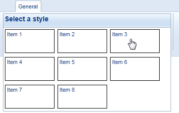
Figure 18
In my sample application, each item in the RibbonBarScrollable control represents a CSS class a user can choose among (such as Normal, Heading 1 etc. that you saw in Figure 16). The CSS classes are stored in a separate CSS file called DvkStyles.css in the Styles folder of the DvkArticles custom module folder. To style the items in the RibbonBarScrollable, I simply apply the CSS class to the relevant <div />, like this:
<td><div class="styleItem HighContrast">High Contrast</div></td>
I am applying both styleItem and HighContrast, which together make the item look like a RibbonBarScrollable item, with content that looks like the HighContrast class.
In order to do something useful when the user selects an item, you can use an onclick handler that executes some code and that receives the value of the selected item. You see how this works in the next part of this article series.
With these changes applied, the code for the control could look like this:
<dw:RibbonBarScrollable ID="myScrollable" Name="Select a style"
          RowsExpression="tr[class='stylesRow']" runat="server">
  <table class="stylesTable" cellpadding="0" cellspacing="0">
  <tr class="stylesRow">
    <td><div class="styleItem Normal">Normal</div></td>
    <td><div class="styleItem HighContrast">High Contrast</div></td>
    <td><div class="styleItem Heading1">Heading 1</div></td>
  </tr>
  <tr class="stylesRow">
  <td><div class="styleItem Heading2">Heading 2</div></td>
    <td><div class="styleItem Heading3">Heading 3</div></td>
    <td><div class="styleItem Paragraph">Paragraph</div></td>
  </tr>
  <tr class="stylesRow">
    <td><div class="styleItem Introduction">Introduction</div></td>
    <td><div class="styleItem Code">Code</div></td>
  </tr>
  </table>
</dw:RibbonBarScrollable>
When run in the browser, this results in the control shown in Figure 16.
It’s not always possible or desirable to hard code the items in the control using static HTML. You may have content coming from a database, an XML file or some other dynamic source. In that case, you can data bind the control. To do this, you have a few options. You could programmatically create a System.Web.UI.WebControls.Table and added rows and cells to it as you see fit. Alternatively, you can create a nested Repeater control (an outer Repeater for each row, and an inner Repeater for the individual items). This is how the sample code for the Dynamicweb controls does it. However, I find it much easier to use a standard ASP.NET ListView control instead which is what I am using in the sample application. This control supports grouping which makes it easy to define rows (defined in the GroupTemplate) and items (defined in the ItemTemplate). The following snippet shows an example of the ListView that uses a data source that has a Value and a Name property (you’ll see the code for that a little later)
<dw:RibbonBarScrollable ID="myScrollable" Name="Select a style"
        RowsExpression="tr[class='stylesRow']" runat="server">
  <asp:ListView ID="stylesList" runat="server" GroupItemCount="3"
      ItemPlaceholderID="itemsGoHere" GroupPlaceholderID="groupsGoHere"
      OnItemCreated="ListView1_ItemCreated">
    <LayoutTemplate>
      <table class="stylesTable" cellpadding="0" cellspacing="0">
        <asp:PlaceHolder runat="server" ID="groupsGoHere"></asp:PlaceHolder>
      </table>
    </LayoutTemplate>
    <GroupTemplate>
      <tr class="stylesRow">
        <asp:PlaceHolder runat="server" ID="itemsGoHere"></asp:PlaceHolder>
      </tr>
    </GroupTemplate>
    <ItemTemplate>
      <td><div class="styleItem <%#Eval("Value")%>"><%#Eval("Name")%></div></td>
    </ItemTemplate>
  </asp:ListView>
</dw:RibbonBarScrollable>
Most of this code is pretty straight-forward as it’s standard ASP.NET stuff. The only thing worth noting is the ItemTemplate code. I am mixing plain HTML and in-line data binding expressions to get the required values (like HighContrast) and names (like High Contrast) into the <div />. The control is data bound using a dictionary that contains the class name and friendly description. Here’s the relevant code from the Code Behind of the class with the RibbonBarScrollable:
public partial class AddEditArticle : System.Web.UI.Page
{
  protected void Page_Load(object sender, EventArgs e)
  {
    InitializeStylesGallery();
    // Other code here
  }
  private void InitializeStylesGallery()
  {
    Dictionary<string, string> Styles = new Dictionary<string, string>()
    {
      {"Normal", "Normal"},
      {"HighContrast", "High Contrast"},
      {"Heading1", "Heading 1"},
      {"Heading2", "Heading 2"},
      {"Heading3", "Heading 3"},
      {"Paragraph", "Paragraph"},
      {"Introduction", "Introduction"},
      {"Code", "Code"}
    };
    if (!Page.IsPostBack)
    {
      stylesList.DataSource = Styles;
      stylesList.DataBind();
    }
  }
  // Other code here
}
When the page loads, InitializeStylesGallery is called which creates a list of dictionary entries, each one holding the CSS class name and a user friendly description. When the page is not posting back, the ListView gets the Styles dictionary as its data source and is data bound. This causes the ListView to render the appropriate groups and items which are needed for the RibbonBarScrollable. In the next part in this article series you’ll see how to add client side code to improve the behavior of the RibbonBarScrollable and how to store the selected value in a hidden field so it becomes available at the server.
Wrapping Up
At this stage, the Default.aspx and AddEditArticle.aspx pages have a good looking UI. However, the RibbonBar controls are still quite useless as I haven’t defined any server or client side behavior for them. In the next two articles, see how to interact with the controls from client side JavaScript and server side .NET code.
Downloads
With each article, I'll make a download available with the user interface I've built so far (based on the sample application I built for the article series about developing custom modules). Additionally, you can download the full running demo with all changes up to the latest part in the series. The first download always shows the code from the article you're reading, while the second download is the full example and may contain code that is added or changed in later parts of the series.


