Building Dynamicweb Module Admin Interfaces 3 - Using the Ribbon UI - Handling Client Side Events
NOTE: the concepts presented in this article are now considered obsolete possibly because better alternatives are available.
This is part three in a multi-part article series on building custom administrative user interfaces using the Dynamicweb UI controls such as the RibbonBar. If you haven’t read the previous articles, you should check them out first as they contain information that’s used again in this article. You can find the articles here:
- Building Dynamicweb Module Admin Interfaces 1 - Introduction
- Building Dynamicweb Module Admin Interfaces 2 - Using the Ribbon UI – Introduction
As you saw in part two of this series, many of the RibbonBar controls have options to trigger behavior at the client (typically with the OnClientClick property) and at the server (either with a Click event or when the page is processed at the server).
In this part, I’ll show you how to deal with a number of client side events, including:
- Implementing the “New Article” button
- Activating the Copy and Delete buttons on the Manage tab on Default.aspx when at least one article is selected
- Switching to the Manage tab automatically when an article gets selected
- Showing the Dialog control for the introduction text
- Collapsing the RibbonBarScrollable when a CSS class is selected
- Storing the selected value in a hidden text field when a CSS class is selected
- Scrolling the chosen CSS class into view and highlighting the selected item on the RibbonBarScrollable
Let’s start with implementing the New Article button as it’s the easiest to implement.
Handling a Button’s OnClientClick
As you may recall from part 2, the RibbonBarButton has an OnClientClick property that enables you to define some JavaScript that is triggered when the button is clicked. Since creating a new article is as simple as redirecting the user to AddEditArticle.aspx, all that you need on the newButton control is the following code:
<dw:RibbonBarButton runat="server" Text="New" Size="Large" Image="AddDocument"
    ID="newButton" Title="Create new article"
    OnClientClick="location.href='AddEditArticle.aspx';" />
Once you have this code in your page and click the New button on the RibbonBar, you’re taken to AddEditArticle.aspx. In that page you can add similar behavior to the Cancel buttons to take the user back to the Default.aspx page:
<dw:RibbonBarButton ID="cancelButton1" Size="Small" Text="Cancel" Image="Cancel"
     runat="server" OnClientClick="location.href='Default.aspx'" />
Rather than using in-line code, you can of course also call a function, like this:
<dw:RibbonBarButton ID="cancelButton1" Size="Small" Text="Cancel" Image="Cancel"
    runat="server" OnClientClick="cancelEdit();" />
The cancelEdit function could then redirect the user, but optionally carry out some other actions, such as asking the user for confirmation first.
Activating Buttons and Tabs
The next client behavior that is needed in Default.aspx is enabling the Copy and Delete buttons on the Manage tab. These buttons operate on selected articles, so you need to have at least one article selected before these buttons can be enabled. To enable the selection of articles, I added a checkbox in front of each article, using the following code:
<HeaderTemplate>
  <table border="0" cellpadding="0" style="width: 600px;" id="articlesTable">
  <!-- Other code here -->
</HeaderTemplate>
<ItemTemplate>
<tr>
  <td>
    <input id="chk<%# Eval("Id") %>" type="checkbox"
                       value='<%# Eval("Id") %>' name="ArticleId" />
  </td>
  <td>
    <asp:Literal ID="litTitle" runat="server" Text='<%# Eval("Title") %>' />
  </td>
  <!-- Other columns go here -->
</ItemTemplate>
In a later part in this series you’ll see how the Repeater control is replaced with a DynamicwebList control, making displaying and selecting articles a lot easier.
Once the checkboxes are in the HTML, I can address them with client side code to do the following:
- Hook up a handler to the click event of each checkbox so I can execute a function when a checkbox is clicked
- When a checkbox is clicked, determine whether the list contains at least one checked checkbox, and then enable or disable the correct buttons and tabs.
The first task is easily accomplished with a JavaScript library such as jQuery or Prototype. I am a big fan of jQuery so that’s what I typically use for applications like these. However, the Dynamicweb administrative interface already uses Prototype, so it makes sense to continue using that (avoiding loading multiple frameworks, and potential conflicts between the two libraries). With Prototype I can hook into the window’s load event and then use a CSS expression to find all checkboxes in the article list. I can then loop over the list and bind a function to each checkbox’s click event, like this:
Event.observe(window, 'load', function ()
{
  $$('#articlesTable input[type=checkbox]').each(function (el)
  {
    Event.observe(el, 'click', selectedArticlesChanged);
  });
});
Notice how I am using #articlesTable input[type=checkbox] to find all input elements of type checkbox with the HTML element (a table in this case) with an id of articlesTable which is defined in the HeaderTemplate of the Repeater control.
With this code, selectedArticlesChanged is called whenever you click a check box. In the last part of this article series where you see how to use the Dynamicweb List control, I'll remove most of this code again, as the List control supports selection out of the box.
Inside the selectedArticlesChanged function you can count the number of checked checkboxes, activate or deactivate the Copy and Delete buttons and switch to the correct tab, like this:
function selectedArticlesChanged()
{
  var numberOfSelectedArticles =
         $$('#articlesTable input[type=checkbox]:checked').length;
  if (numberOfSelectedArticles > 0)
  {
    Ribbon.enableButton('deleteButton');
    Ribbon.enableButton('copyButton');
    Ribbon.tab(2, 'myRibbon');
  }
  else
  {
    Ribbon.disableButton('deleteButton');
    Ribbon.disableButton('copyButton');
    Ribbon.tab(1, 'myRibbon');
  }
}
This code now uses the Prototype $$ function to select multiple elements, Additionally, it uses the :checked pseudo class to return checked checkboxes only. You can then check the length property of the returned collection to see if at least one item is checked. The Ribbon object (which is brought into scope automatically by including a link in the ControlResources control to Ribbon.js which you can find under Admin/Images/Ribbon/Ribbon.js in case you want to look at its source), then has convenient methods such as enableButton, disableButton and tab. The tab method takes the one-based index of the tab you want to select and the client side ID of the RibbonBar.
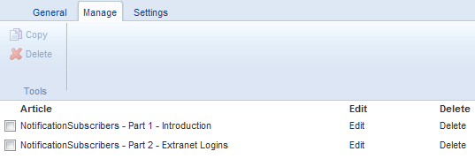
Before at least one article is selected, the RibbonBar looks like the one shown in Figure 1:

Figure 1
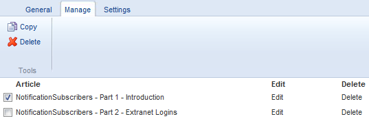
However, as soon as you check one of the checkboxes, the buttons become available (and the Manage tab is made the active tab if that wasn’t already the case).

Figure 2
If you uncheck all checkboxes, the Copy and Delete buttons are disabled again, and the RibbonBar switches back to the General tab.
In the next article in this series – that deals with server side events, you see how to handle the Click events of the Copy and Delete buttons at the server. In a later part in this series you see the List control at work which makes it easy to select one or more articles using checkboxes and which has built-in support for a “Select all” checkbox.
The next action on the list of client side code is showing the Dialog control.
Working with the Dialog control
As you saw in part 1 of this article series, the Dialog control displays itself as a floating and draggable window. Its contents can be a mix of server side controls and standard markup, giving you full control over its appearance. The Dialog control has the following relevant properties:
| Name | Description |
ShowCancelButton |
Determines whether or not the control shows a Cancel button at the bottom of the dialog. By default, the Cancel button will just hide the control, but you can override this behavior using the CancelAction property. |
ShowClose |
Determines whether or not the control shows a Close button at the top of the dialog. The Close button hides the dialog when clicked. |
ShowHelpButton |
Determines whether or not the control shows a Help button at the bottom of the dialog. By default, the Help button takes the user to the Dynamicweb documentation web site (based on the HelpKeyword and HelpLanguage properties), but you can override this behavior using the OnClientHelp property. |
ShowOkButton |
Determines whether or not the control shows an OK button at the bottom of the dialog. When you click the OK button, the panel is hidden. |
OnClientHelp |
A piece of custom JavaScript that is triggered when a user clicks the Help button. |
CancelAction |
A piece of custom JavaScript that is triggered when a user clicks the Cancel button. |
OkAction |
A piece of custom JavaScript that is triggered when a user clicks the Ok button. |
FinalizeActions |
When set to true, appends “return false;” to each client click action to prevent other code from being executed. |
HelpKeyword / HelpLanguage |
Used to determine the help topic on the Dynamicweb web site. Probably not very useful to custom module developers, unless you want to link to an existing topic. |
Title |
Gets or sets the title of the control, displayed in the dialog’s windows title bar. |
Width |
Gets or set the total width of the control. |
You can place the Dialog control’s markup anywhere in the page. I typically place them near the end, close to the closing </form> tag so the code doesn’t get in the way too much when designing my pages. In the sample application that comes with the article, I use the following code:
<dw:Dialog ID="IntroTextDialog" runat="server" Width="700" Title="Intro text"
     ShowOkButton="true">
  <dw:Editor ID="IntroText" runat="server" ForceNew="true" Toolbar="FrontendEdit"
     Width="564" Height="200" />
</dw:Dialog>
As the contents of the Dialog, I used a Dynamicweb Editor control. Server side, when the settings are saved, I retrieve the text entered in the editor and save it in the database. You see how this works in the next article in this series.
To show the Dialog in the first place, I added an OnClientClick handler to the Intro Text button:
<dw:RibbonBarButton ID="introTextButton" runat="server" Text="Intro Text"
    Size="Small" Image="Tree" Title="Modify the introduction text"
    OnClientClick="dialog.show('IntroTextDialog');" />
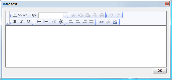
As you can see, all you need to do to display the dialog is call dialog.show and pass in the client ID of the dialog, IntroTextDialog in this example. If you click the Intro Text button, you see the dialog shown in Figure 3:

Figure 3
When you click the OK button, the Dialog is hidden again. The Editor control maintains its text though.
The final two client actions in the sample application deal with the RibbonBarScrollable control.
Extending the behavior of RibbonBarScrollable
As mentioned in the introduction of this article, the RibbonBarScrollable can benefit from three client side operations:
- Collapse the panel when an item has been chosen when the control was expanded.
- Store the selected CSS class in a hidden field.
- Highlight the currently selected item, and scroll the correct row of items into view when an item is selected.
The first two actions are pretty easy to implement and require three changes to the code: an onclick handler to each item in the list, a function that hides the popup and a hidden field somewhere in the page.
First, I added a HiddenField server control to the page to store the selected CSS class:
<asp:HiddenField ID="selectedCssClass" runat="server" />
I then modified the code in the ItemTemplate of the ListView to the following (refer to the previous article in this series for an explanation of the code for the ListView control):
<ItemTemplate>
  <td>
    <div class="styleItem <%#Eval("Key")%>"
      onclick="handleStyleChange('<%#Eval("Key")%>');"><%#Eval("Value")%>
    </div>
  </td>
</ItemTemplate>
When the item is clicked, the Key of the Dictionary (e.g. the CSS class name) is passed to the handleStyleChange function where I store the value in the hidden field I created earlier, and close the popup with this code:
function handleStyleChange(selectedStyle)
{
  $('selectedCssClass').value = selectedStyle
  myScrollable_scrollable.hidePopUp();
}
Back at the server I can access the HiddenField’s Value property to retrieve the class the user has selected. You see this at work in the next article.
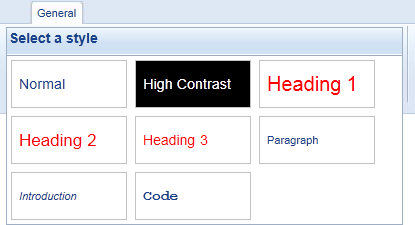
The final requirement – highlighting the selected item and scrolling the selected row into view is a little trickier. Consider the following RibbonBarScrollable control that was introduced in the preceding article:

Figure 4
Imagine you choose the Introduction style by clicking it. When that happens, I want to collapse the control again, highlight the Introduction class and then make sure that the row with the Introduction and Code classes (the third row) becomes visible. Scrolling a row into view is pretty easy with the scrollTo method (which expects the zero-based index of the row you want to scroll in to view). However, because of the way the control works, it can be a bit tricky to find out which row to scroll into view exactly. The control doesn’t know that the Introduction class is in the third row, so you need to pass this information to the handleStyleChange yourself. This means that the HTML for the item should end up like this:
<div class="styleItem Introduction"
    onclick="handleStyleChange('Introduction', 2);">Introduction</div>
Here, the second argument to handleStyleChange is the zero-based row index of the item. The ListView doesn’t expose a row index automatically, but you can calculate it yourself with some custom code. First, I subscribed to the ListView’s ItemCreated event, and then added the following code to the Code Behind of AddEditArticle.aspx:
protected internal int RowIndex { get; set; }
protected void ListView1_ItemCreated(object sender, ListViewItemEventArgs e)
{
  ListViewDataItem test = e.Item as ListViewDataItem;
  if (test.DataItemIndex % stylesList.GroupItemCount == 0)
  {
    RowIndex = test.DataItemIndex / stylesList.GroupItemCount;
  }
}
This code is run for each item that is added to the ListView. It looks at the item’s DataItemIndex and compares it with the GroupItemCount property of the ListView. This property determines the number of horizontal items in each “row”; which is 3 in my example. When the DataItemIndex modulo GroupItemCount is zero, I update the RowIndex property. Effectively, this updates that property for the first item, and then for each third item. The RowIndex property is used in the data binding of the ListView’s ItemTemplate, which causes the correct value to get injected in the call to handleStyleChange:
<div class="styleItem <%#Eval("Key")%>"
     onclick="handleStyleChange('<%#Eval("Key")%>', <%# RowIndex %>);">
  <%#Eval("Value")%>
</div>
Notice how I am directly binding against the Page’s RowIndex property using: <%# RowIndex %> to get the up-to-date value of that property in the final HTML.
With the correct index being passed to handleStyleChange, the next step is to modify that function and use the row index to scroll the correct row into view. I updated handleStyleChange as follows:
function handleStyleChange(selectedStyle, rowIndex)
{
  $('selectedCssClass').value = selectedStyle;
  myScrollable_scrollable.hidePopUp();
  if (myScrollable_scrollable.current != rowIndex)
  {
    myScrollable_scrollable.scrollTo(rowIndex);
  }
}
You can use the current property of the RibbonBarScrollable control at the client to determine the currently displayed row. When the new index is different from the current index, scrollTo is called to scroll the correct row into the control’s view port.
To highlight the currently active item in the control so the user knows which one is selected, you can pass a reference to the clicked item in the ListView’s ItemTemplate, like this:
<div class="styleItem <%#Eval("Key")%>"
   onclick="handleStyleChange('<%#Eval("Key")%>', <%#  RowIndex %>, this);">
    <%#Eval("Value")%>
</div>
Notice the inclusion of the this parameter which points to the <div> element. In the handleStyleChange function you can then apply a CSS class to this item, after you’ve removed the same CSS from all items in the control (to remove any previously applied highlight):
function handleStyleChange(selectedStyle, rowIndex, control)
{
  $('selectedCssClass').value = selectedStyle;
  myScrollable_scrollable.hidePopUp();
  if (myScrollable_scrollable.current != rowIndex)
  {
    myScrollable_scrollable.scrollTo(rowIndex);
  }
  $$('div.styleItem').each(function (el)
  {
    el.removeClassName('highlight')
  });
  $(control).addClassName('highlight');
}
Here, I am using Prototype again to find all items (by their class name styleItem) and call removeClassName on each of them. The final line of code than assigns the same class to the control that was passed to the function. The highlight class can be as simple or complex as you want. In the sample application I am using a customized version of one of the background images of the ribbon control:
.stylesTable .highlight
{
  background-image : url(/Images/Highlight.gif);
}
When you now select an item in the RibbonBarScrollable , the currently selected item is highlighted, as shown in Figure 5:
Highlighting the selected item concludes the client side functionality that’s required for the Custom Articles module. Clearly, the examples you have just seen don’t cover the wide range of possibilities that the Dynamicweb interface controls offer. You’re encouraged to experiment with the controls to get a better understanding of the many features these controls offer.
In the next part of this series you’ll see ways of dealing with the controls at the server.
Downloads
With each article, I'll make a download available with the user interface I've built so far (based on the sample application I built for the article series about developing custom modules). Additionally, you can download the full running demo with all changes up to the latest part in the series. The first download always shows the code from the article you're reading, while the second download is the full example and may contain code that is added or changed in later parts of the series.

